 Fynchat
Dashboard
A tour of the Dashboard — your KPIs, alerts, and charts, plus how to pick a reporting period and export your data.
What is the Dashboard?
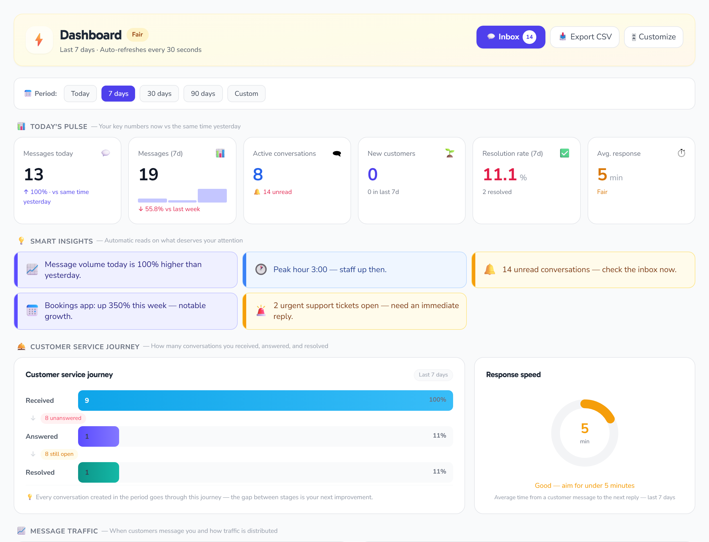
The Dashboard (/dashboard) is your account's home screen: an analytics and metrics page that brings the pulse of your WhatsApp activity into one place — messages, conversations, campaigns, templates, customer satisfaction, and installed apps. It is a mostly read-only page; its only real controls are the reporting-period selector and Export CSV, and everything else is a metric scoped to your account that refreshes on its own.
Every number shown belongs to your account only, and the page refreshes itself automatically every 30 seconds with no manual reload.
To open the Dashboard you must be signed in with a verified email and have your WhatsApp account connected. Data is isolated per account, so you only ever see your own. If you haven't finished the initial setup yet, you'll be sent to the onboarding page instead of the Dashboard.
Choosing the reporting period
The main control at the top of the page (next to 📅 Period:) is a set of segmented buttons that set the time window all metrics are calculated over:
| Button | Range |
|---|---|
| Today | Your current day |
| 7 days | Last 7 days (default) |
| 30 days | Last 30 days |
| 90 days | Last 90 days |
| Custom | A range you set yourself |
Selecting any range re-queries the whole dashboard for that window, and the default range is 7 days.
Choosing Custom reveals two date fields (from / to); set both dates, then click Apply. The range only takes effect once both dates are set, and a custom range is shown as YYYY-MM-DD → YYYY-MM-DD.
A note on time windows: some metrics are labeled "(7d)" but their value follows the range you actually selected. The fixed exceptions are: the Activity-hours heatmap and the Bot ↔ agents ratio are always the last 7 days, customer satisfaction (CSAT) is the last 30 days, and AI figures are the current calendar month.
Automatic refresh
The dashboard refreshes itself every 30 seconds (as the subtitle "Auto-refreshes every 30 seconds" notes), preserving your scroll position and page state. Heavy calculations (charts, apps, team, average response) are cached for about 60 seconds on the server, so each refresh stays light.
Export CSV
The 📥 Export CSV button downloads your data for the currently selected period. The file is not a copy of the on-screen KPIs; it is a message log grouped by day, direction, and type, with the columns Date, Direction, Type, Count. The file name follows the pattern dashboard_{range}_{date}.csv, and it is encoded as UTF-8 (with a BOM) so it opens correctly — including Arabic — in Excel.
Overall-health badge
At the top of the page a colored banner titled Dashboard carries a badge that summarizes your account's overall health, computed automatically from the number of warning-level insights:
| Badge | When it appears |
|---|---|
| ✅ Excellent | No warning insights |
| ⚡ Fair | One or two warning insights |
| ⚠ Needs attention | Three or more warning insights |
Operational alerts
These red banners appear only when something calls for them:
- WhatsApp account needs reconnecting: a banner listing each broken WhatsApp account (by name or number, with a snippet of the error) and a Reconnect button that takes you to /settings. It shows only when at least one account's connection status is "needs reconnection," and its heading reads "WhatsApp account needs reconnecting — messages may fail."
- Service paused — subscription inactive: a banner shown when your subscription is inactive, reading "Renew your subscription to resume sending and automation," with a Renew now button to /billing.
Operational cards
Subscription
The Subscription card shows your plan name and one of: trial days left ("🎁 Free trial — {n} days left") or the renewal date ("Renews:"). If an invoice is due, a notice shows its amount ("Invoice due: {n} SAR") with a Pay link, alongside a Manage subscription → link. All links go to /billing.
Plan usage
Progress bars show usage versus the limit for each metered resource: Contacts, Auto-replies, WhatsApp accounts, Seats, Bot flows, and Workflows. A bar turns amber at 80% and rose at 100% or more. Unlimited (or unset) limits are skipped; if all your limits are unlimited, it shows "All your plan limits are unlimited."
Quick actions
Four shortcut buttons: 📣 Campaign → /campaigns, 👤 Contact → /contacts, ⚡ Auto-reply → /auto-replies, and 📋 Template → /templates.
Welcome checklist (new accounts)
If your account hasn't sent or received any message yet, a welcome card titled "👋 Welcome to Fynchat — let's get started" appears with four setup steps:
- Connect WhatsApp → /settings
- Add contacts → /contacts
- Enable an auto-reply → /auto-replies
- Create your first campaign → /campaigns
This checklist disappears automatically once your account has any messages.
Smart analytics
The Smart analytics section shows insight cards generated by the system (good / warning / info), each with an icon, a short sentence filled in with your numbers, and a count. Among the rules that generate them:
- Fast or slow response time (e.g. "Average response time is {min} minutes — excellent.")
- Message volume versus yesterday (beyond 30%)
- Resolution rate (85%+ good / below 50% warning)
- Peak hour
- Bot coverage (70%+ / below 20%)
- Unread backlog (5 or more — e.g. "{n} unread conversations — check the Inbox now.")
- New-customer growth (beyond 50%)
- Per-app growth or decline, and urgent support tickets
Primary KPIs
A row of six cards:
| KPI | What it shows |
|---|---|
| Messages today | Messages since midnight, with the percentage change versus yesterday (green up / red down), or "— no comparison" when both today and yesterday have no messages |
| Messages (7d) | Message count for the selected period, with the percentage change versus the previous equal window (the value follows the selected range despite the "7d" label) |
| Active conversations | Count of open/pending conversations, with "🔔 {n} unread" or "✓ All read" |
| New customers | New contacts today, plus a sub-line with new contacts over the selected period |
| Resolution rate (7d) | Of conversations created in the period, the share now resolved (capped at 100%), with "{n} resolved" |
| Avg. response | Average first-response time in minutes, with a status: under 5 "Excellent" / under 30 "Fair" / otherwise "Needs improvement" |
Engagement row
| Card | What it shows |
|---|---|
| Last campaign | Newest non-draft campaign: name + Sent / Delivered% / Read% / Failed, with a link to /campaigns |
| Templates | Count of approved templates, with "⏳ {n} pending" and "⛔ {n} rejected" badges or "✓ All ready," and a link to /templates |
| Customer satisfaction (30d) | Average customer rating out of 5 over the last 30 days with the rating count, or no ratings yet |
| AI (this month) | Count of AI auto-replies this month and its cost ($), with a link to /automation/analytics |
Installed-app cards
Each installed app gets its own KPI card showing a primary metric, a change, and secondary stats, and links to the app. Currently supported:
| App | Example metrics |
|---|---|
| Bookings | New / confirmed / upcoming / no-shows |
| Store | Orders / paid / processing / revenue (SAR) |
| Real estate | Leads / hot / viewings |
| Car dealerships | Inquiries / test drives |
| Support tickets | New / open / urgent / closed |
A card appears only for apps that are actually installed and set up. The section is titled Installed apps and includes a manage link to /apps; if you have no apps, an invitation to browse apps appears instead.
Charts
- 📈 Message volume: a daily bar chart of inbound + outbound over the period with hover tooltips, plus a footer showing Inbound (7d), Outbound (7d), Total customers, and Subscribers.
- 🕐 Activity-hours heatmap: a 24-cell heatmap of the hours of the day (always the last 7 days) with the peak hour highlighted and a low-to-high color scale.
- 🤖 Bot ↔ agents: a donut showing the share the bot handles, with bot-versus-agent counts (last 7 days).
- 📊 Conversation statuses: horizontal bars of conversations by status over the period (Open / Pending / Resolved / Closed / Spam); if there's no data, it shows "No data in this period."
- 📨 Message types: the top 6 message types by count over the period (Text / Image / Video / Audio / Document / Template / Interactive / Button / Location / Contact).
Hot conversations
A list of up to 8 open/pending conversations that either have their 24-hour window nearly expiring (under 2 hours) or have unread messages. Each row shows a VIP badge (if any), the contact's name/number, the unread count, the time of the last message, and a link that opens the conversation in /inbox. If there are no urgent conversations, a notice says so.
Team activity
The Team activity (7d) card shows up to 5 agents active over the selected period (the window follows your chosen range, like the other "7d" metrics), each with a presence dot (Available / Busy / Away / Offline), a "Handled" count, and a "Resolved" count. It appears only when there are users, assigned conversations, and someone has handled conversations; otherwise an empty-state card is shown.
Quick tips
- Start your day by scanning the alerts at the top and the Hot conversations list.
- Switch the reporting period to compare today against the week or month — and remember the heatmap and bot ratio stay fixed on the last 7 days.
- Use 📥 Export CSV when you need the raw message data in Excel.
- Watch the plan-usage bars; amber (80%) is an early warning before you hit a limit.
- Follow the smart insights — they surface what deserves your attention first.