 Fynchat
Customer insights: segments and the churn radar
The Customer insights page sorts your customers into six behavioural segments automatically, warns you about the ones who are drifting away before you lose them, and turns any segment into a campaign-ready list in one click.
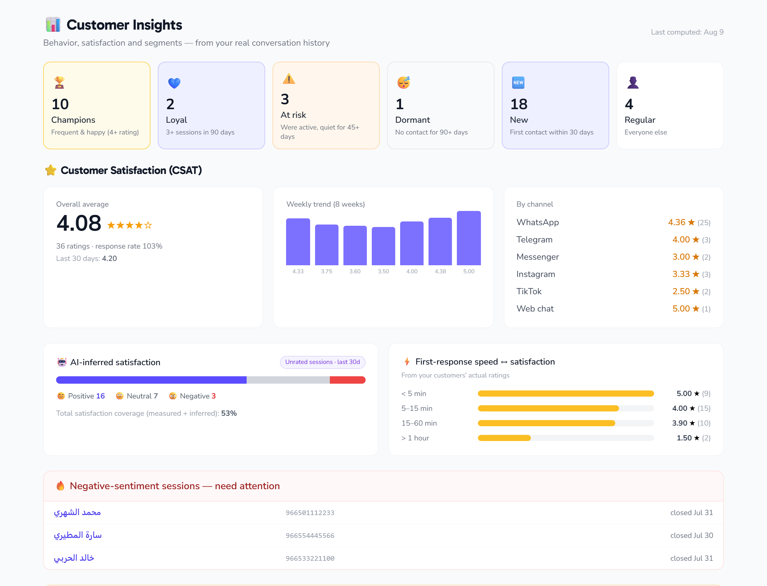
What is "Customer insights"?
An analytics page in the sidebar under Customer insights (/insights). It needs no setup: the system reads your conversations, orders and ratings, then answers one practical question — who your customers actually are, and which of them is about to disappear.
What sets it apart is that every insight is immediately actionable, not just a number: any segment becomes a ready contact list for a campaign at the press of a button.
The six segments
Segments are recalculated automatically every night, and each customer falls into exactly one:
| Segment | Who is in it |
|---|---|
| 🆕 New | First seen in the last 30 days, with one session or none yet |
| 🏆 Champion | 3+ sessions in 90 days and an average rating of 4 or above |
| 💚 Loyal | 3+ sessions in 90 days (no rating condition) |
| ⚠️ At risk | Was active, then went unusually quiet for them (see the radar below) |
| 😴 Dormant | Last inbound message more than 90 days ago |
| 👤 Regular | Everyone the above does not describe |
A session is a whole conversation, not a single message. A customer who sends ten messages in one discussion counts as one session.
Click any segment to open its members with their session count, last contact and average rating.
⚠️ The churn radar: silence measured against the customer's own rhythm
This is the smartest thing on the page. Most systems say "anyone silent for 60 days is at risk" — which is wrong, because a customer who messages you weekly and goes quiet for a month really is at risk, while one who messages you quarterly and goes quiet for a month is perfectly normal.
So the system works out each customer's personal rhythm:
average gap  =  (first seen → last contact) ÷ (their sessions − 1)
churn risk   =  their current days of silence ÷ their average gap
A customer lands in At risk when the risk score reaches 3× their own rhythm or more, provided they have at least 3 sessions, their silence exceeds 7 days (to filter out daily-chatter noise), and has not passed 90 days — at which point they are Dormant instead.
The churn radar shows the 8 highest-risk customers with their days of silence and average gap — and those are exactly the people who deserve a message today.
Highest-value customers
A table of your top 20 customers by total order value, with their order count, segment and average rating in one row.
Its usefulness is in joining value to satisfaction: a customer with high spend and a low rating is the most dangerous line on the whole page.
This table relies on the Orders app; if you do not use it, the table is empty and the rest of the page works as usual.
✅ From an insight to a campaign in one click
Inside any segment, press Turn into a list. A contact list is created from its members at that moment, and it appears straight away in the audience picker for campaigns.
Practical examples:
- At risk → a win-back campaign with a special offer.
- Champion → launch a new product to your best customers first.
- Dormant → a seasonal reminder.
- New → a welcome message introducing your services.
The list is a frozen snapshot taken at creation time; it does not update itself. Create it again whenever you need a fresh audience.
When do the numbers move?
The calculation runs once a night, and the last computation date is shown at the bottom of the page. So do not expect segments to shift within minutes of a new conversation.
Tips
- Open the page weekly and start with the churn radar — it is the highest-return item.
- Segments are built on sessions, so a young account will find most contacts in "New" or "Regular". That is normal.
- Pair it with customer satisfaction to learn why people drifted away, not just who did.